STUDIO: WHITE CACTUS BRANDING & DESIGN
BRANDING | PACKAGING DESIGN
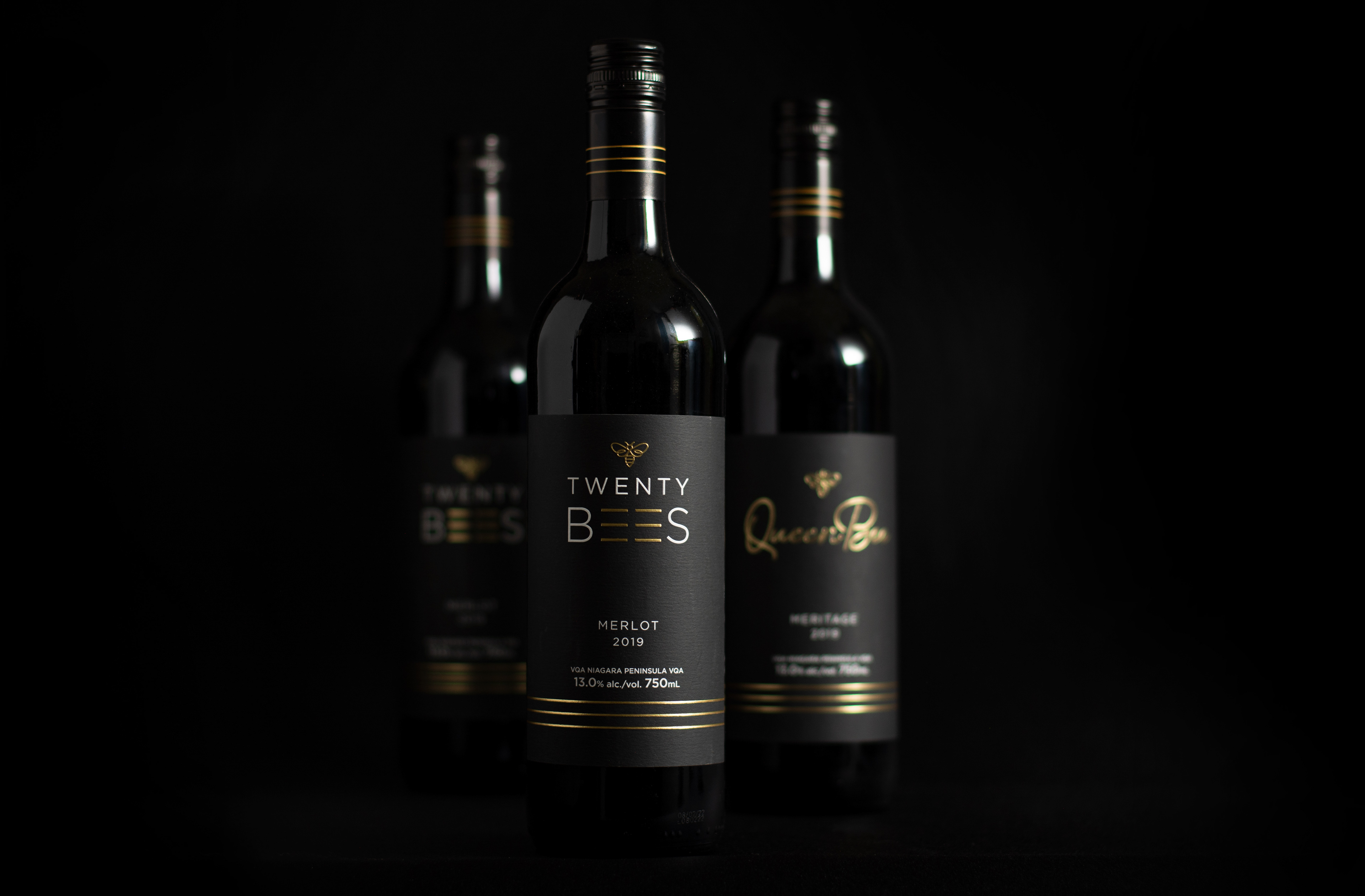
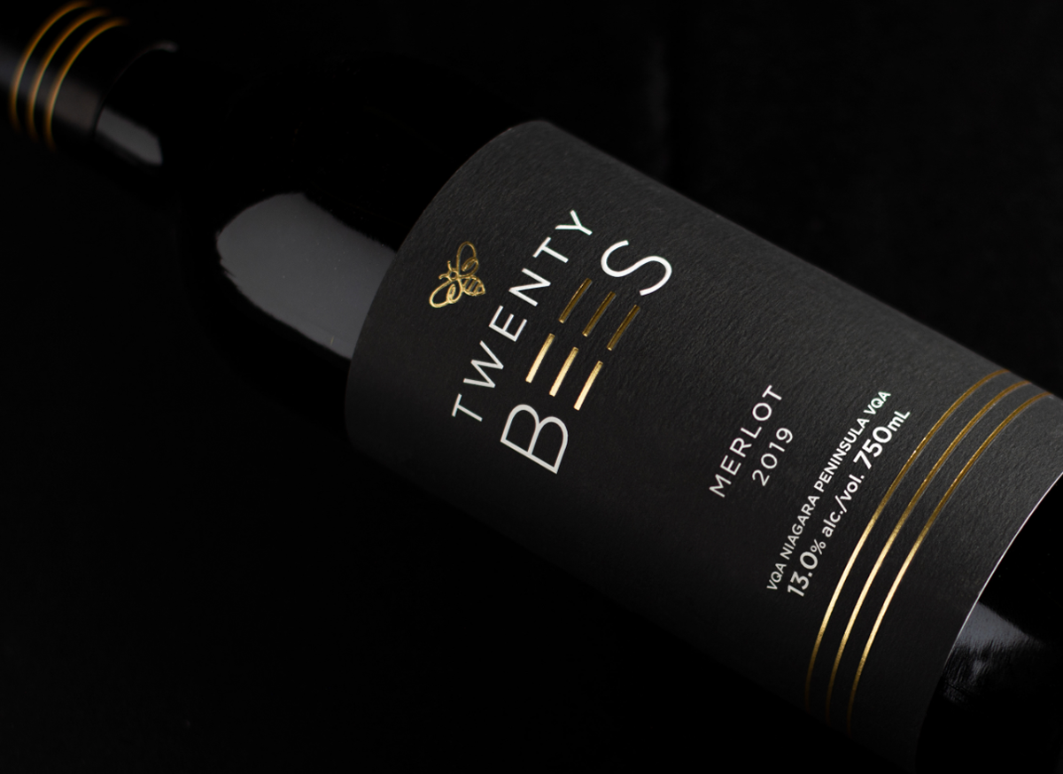


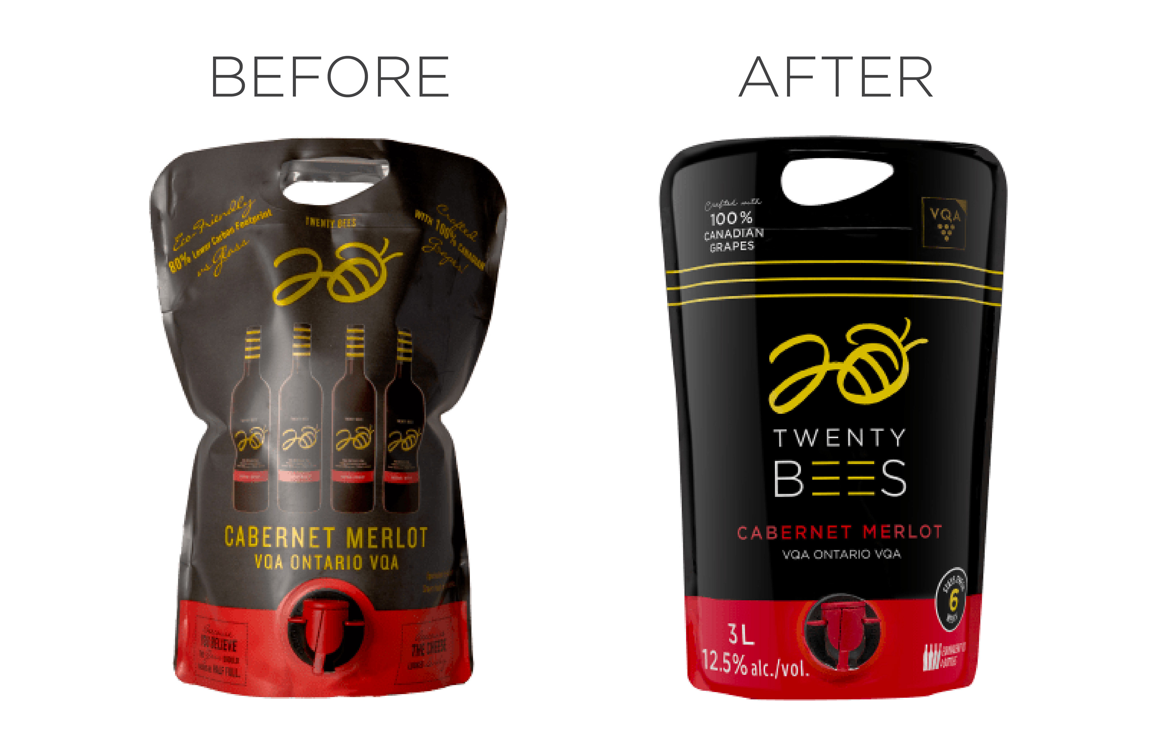

Twenty Bees wines are a celebration of the muddy boots, tired hands, and long days in the vineyards of their passionate Ontario grape growers. Our task for this project was to refresh their logo and to create new labels for an exclusive tier of wines within the Twenty Bees family. With the introduction of this new lineup of wines that are sold exclusively at the vineyard, the goal was to encapsulate the essence of exceptional taste and premium quality. We revamped the logo by creating a new icon that felt more elegant and regal. Drawing inspiration from the bee's iconic stripes, we integrated them throughout the branding and packaging. The simplicity and delicacy of these labels—from the cap to the soft matte stock and elegant gold finishes—elevate the visual appeal of these bottles, reflecting the passion, quality, and dedication poured into crafting these beautiful wines.